Logo Types
A logo help guide
What logo type fits your business best?
Lettermark logo (initials logo, like "abc", "HBO")
A lettermark is a typography-based logo that’s typically only a few letters long, and the letters are usually the initials of the company. A lettermark logo is about simplicity. By utilizing just a few letters, lettermark logos are effective at streamlining any company brand if they have a long name. For instance, how much easier is it to say—and remember—"abc" versus American Broadcasting Company?
Because the focus is on initials, the font you choose (or create) is very important to make sure your logo is not only on-theme with what your company does, but also legible when you print on business cards. Also, if you’re not an established business, you may want to add your full business name below the logo so people can begin to learn who you are right away.
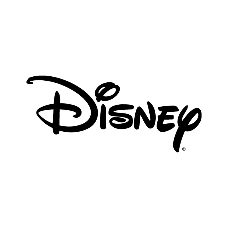
Wordmark logo (like "Facebook", "Disney")
Similar to a lettermark, a wordmark logo is a font-based logo that focuses on a business name alone. Wordmark logos work really well when a company has a distinct name. Disney’s logo is a great example of this. The name itself is catchy and memorable, so when combined with strong typography, the logo helps create strong brand recognition.
Also, like with a lettermark logo, typography will be an important decision. Since the focus will be on your name, you’ll want to pick a font (or create a font) that captures the essence of what your business does. For example, fashion labels tend to use clean, elegant fonts that feel high-end, while legal or financial firms almost always stick to traditional, “heavier” text that feels secure.
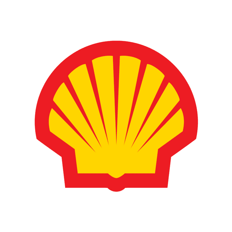
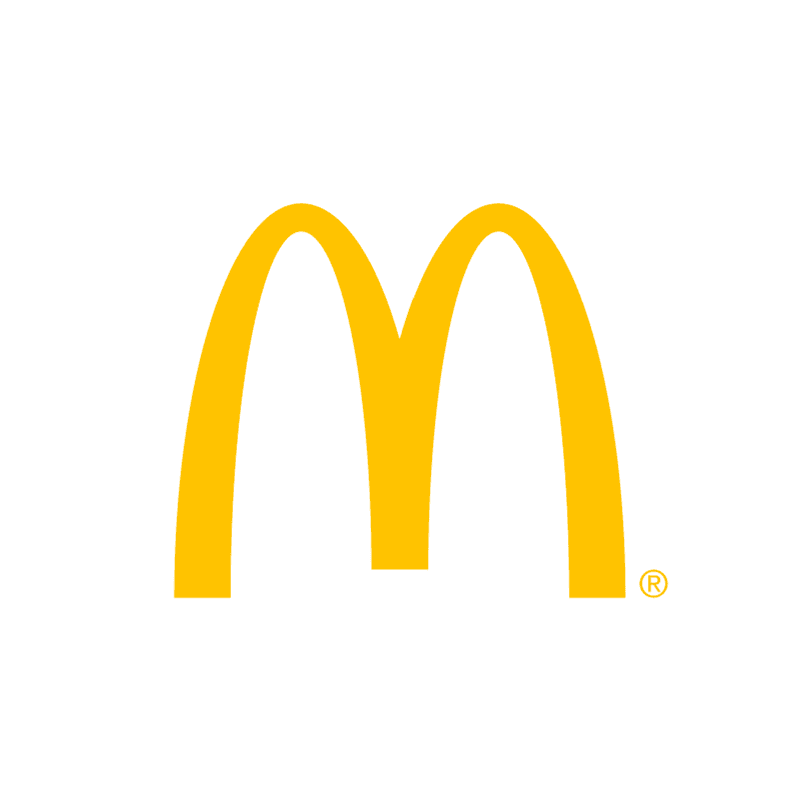
Icon/Symbol logo (like "Shell", "McDonald's")
An icon/symbol (sometimes called a brand mark) is a graphic-based design. It’s probably the image that comes to mind when you think “logo”... the iconic McDonald's golden arches "M" logo and the fuel company Shell. Each of these logos are so emblematic, and each brand so established, that the mark alone is instantly recognizable. A true brand mark is only an image. Because of this, it can be a tricky logo type for new companies, or those without strong brand recognition, to use.
The biggest thing to consider when deciding to go with an icon/symbol is what image to choose. This is something that will stick with your company for its entire existence. You need to think about the broader implications of the image you choose: do you want to play on your name (like John Deere does with their dear logo)? Or are you looking to create deeper meaning (think how the Snapchat ghost tells us what the product does)? Or do you want to evoke an emotion (as the World Wildlife foundation does with their stylized image of a panda—an adorable and endangered species)?
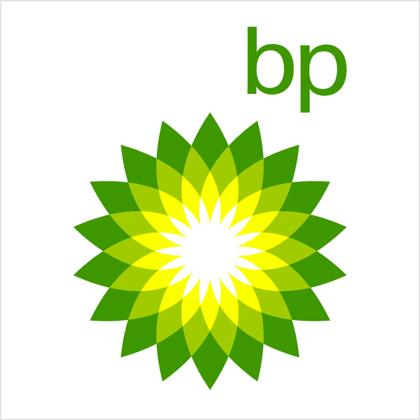
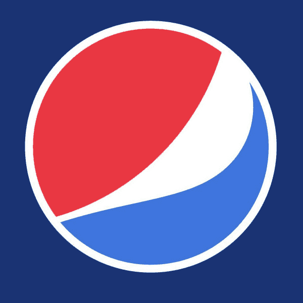
Abstract logo (like "Pepsi", "BP")
An abstract logo is a specific type of icon/symbol logo. Instead of being a recognizable image—like a shell—it’s an abstract or geometric form that represents your business. A few famous examples include the BP starburst/flower, the Pepsi divided circle and Sprint's "pin drop" logo. Like all logo symbols, abstract marks work really well because they condense your brand into a single image. However, instead of being restricted to a picture of something recognizable, abstract logos allow you to create something truly unique to represent your brand.
The benefit of an abstract logo is that you’re able to convey what your company does symbolically, without relying on the cultural implications of a specific image. Through color and form, you can attribute meaning and cultivate emotion around your brand. (As an example, think about how the Adidas stripes are in the shape of a mountain, which represents the challenges athletes face).
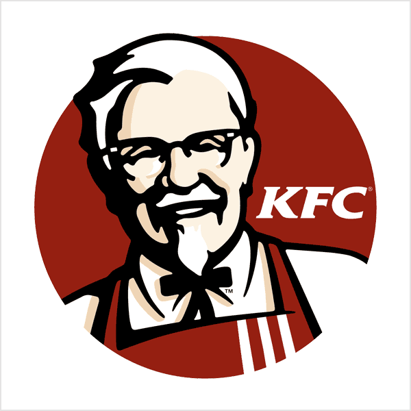
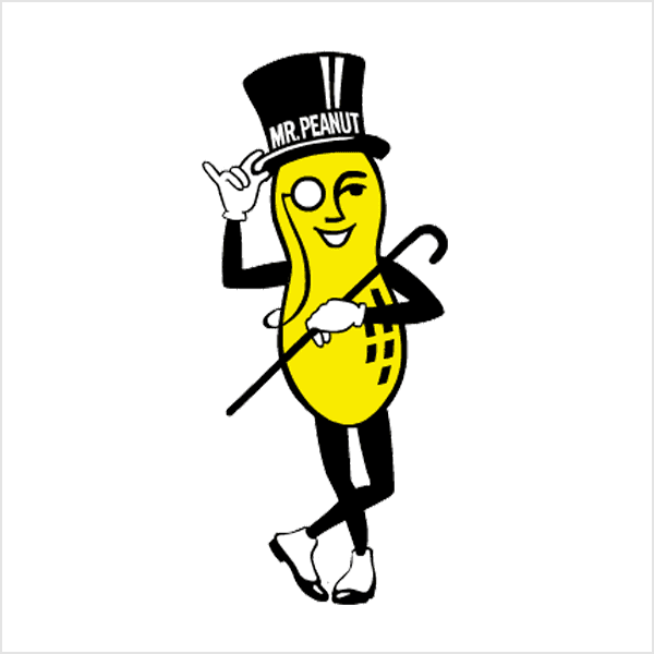
Mascot logo (like "KFC's Colonel Sanders", "Planter's")
Often colorful, sometimes cartoonish, and most always fun, the mascot logo is a great way to create your very own brand character.
A mascot is simply an illustrated character that represents your company. Think of them as the ambassador for your business. Famous mascots include the Michelin Man, Chester Cheetah, KFC’s Colonel Sanders and Planter’s Mr. Peanut. Mascots are great for companies that want to create a wholesome atmosphere by appealing to families and children. Think of all those mascots at sporting events and the great atmosphere they create by getting involved with the audience!
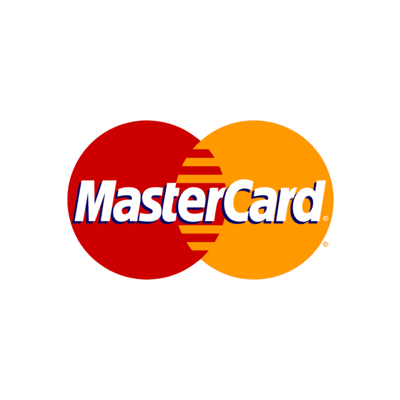
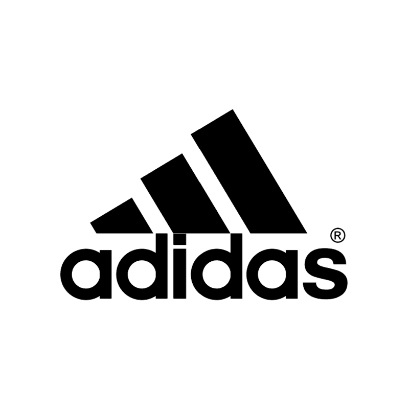
Combination logo (like "Mastercard", "Adidas")
It’s in the name! A combination mark is a logo comprised of a combined wordmark or lettermark and an icon/symbol, abstract mark, or mascot. The picture and text can be laid out side-by-side, stacked on top of each other, or integrated together to create an image. Some well known combination mark logos include Mastercard, Puma and Adidas.
Because a name is associated with the image, a combination mark is a versatile choice, with both the text and icon or mascot working together to reinforce your brand. With a combination mark, people will also begin to associate your name with your icon/symbol or mascot right away! In the future you may be able to rely exclusively on a logo symbol, and not have to always include your name. Also, because the combination of a symbol and text create a distinct image together, these logos are usually easier to trademark than a pictorial mark alone.
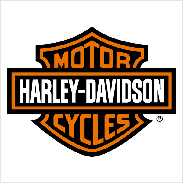
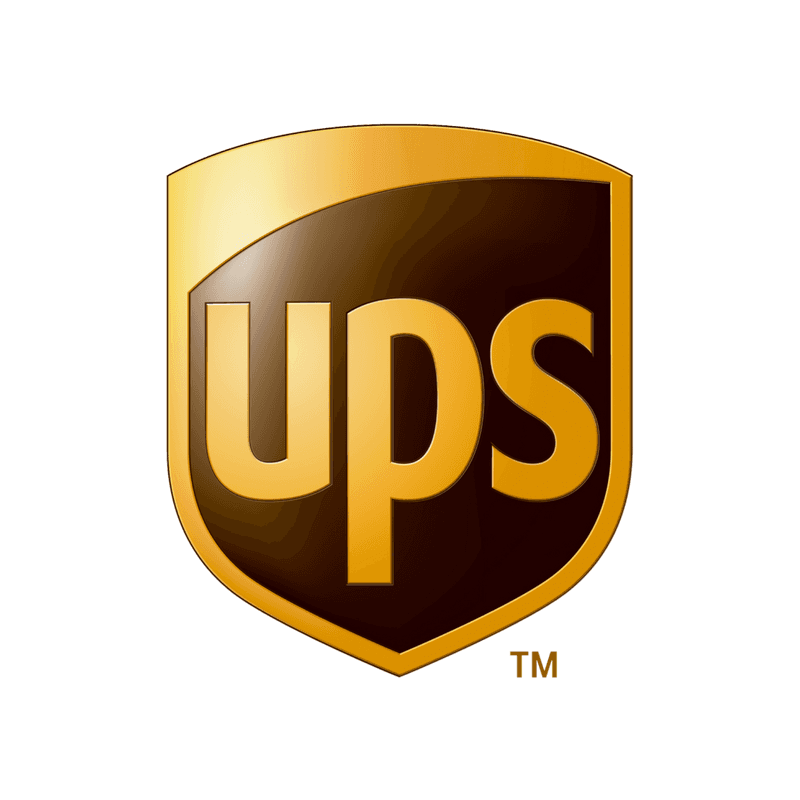
Emblem logo (like "Harley Davidson", "UPS")
The last major type of logo is the emblem. An emblem logo consists of font inside a symbol or an icon—think badges, crests, and seals. These logos tend to have a traditional appearance about them that can make a striking impact, which is why they are often the go-to choice for many schools, organizations or government agencies. The auto industry and craft breweries are also very fond of emblem logos. While they have a classic style, some companies have effectively modernized the traditional emblem look with a logo designs fit for the 21st century (think of the famous UPS crest).
But because this logo design leans towards higher detail, and the fact that the name and symbol are rigidly entwined, they can be less versatile than the previous types of logos. An intricate emblem design won’t be easy to replicate across all branding. For business cards, a busy emblem may shrink so small before it becomes too difficult to read. If you plan on embroidering this type of logo on hats or shirts, you’ll want to have a design created that is on the simple side or it just won’t be possible. As a rule, keep your design uncomplicated and you’ll walk away with a strong, bold look that’ll make you look like the ultimate professional.
Flat rate, all-inclusive branding and website design services by professionals based in Illinois, serving customers nationwide.
Copyright © 2024 Small Bee Inc. / Terms / Privacy / Accessibility